
The logo designed for a church, whose founding pastor’s vision was for every church member to be like an igniting matchstick, “when each matchstick moves on to light up something else…a logo that encapsulates ongoing movement, a spreading of culture/ change/ influence.”
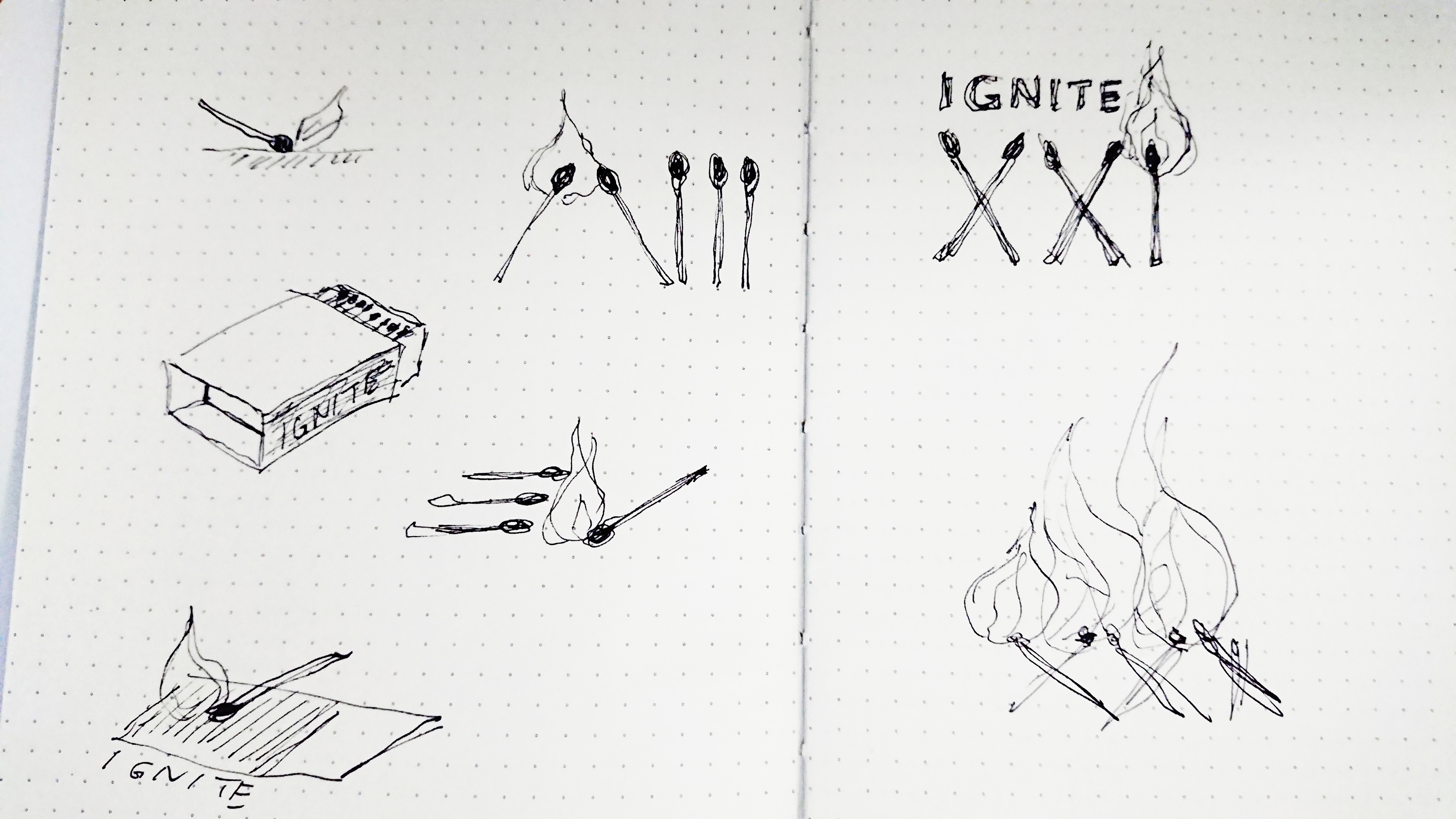
The symbolic vision of a burning matchstick being the anchor of the design, we explored different variations to achieve a sense of movement and an idea of spreading the flame. Finally, the pattern of XXI formed by the stylized matchsticks creates a layered meaning of a ‘twenty-first century church’ and implies the relevance to the times. The flames were stylized to create a sense of movement. We are in the process of designing the rest of the materials for the newly formed church community, including an information pamphlet:

The pamphlet is designed with a contemporary vibe in mind, and the simple layout and bold use of color encapsulates their honest and welcoming approach to community and sharing.
A slightly different interpretation of the logo was used as an accent to punctuate different parts of the pamphlet, such as a single matchstick shown at the moment of igniting:

