A playful and intimate space for a dental clinic, including a reading tree with integrated lighting and a play area for children. We sculpted a one-of-a-kind continuous concrete counter and bench, designed to seat both adults and kids.
Dental Clinic

A playful and intimate space for a dental clinic, including a reading tree with integrated lighting and a play area for children. We sculpted a one-of-a-kind continuous concrete counter and bench, designed to seat both adults and kids.
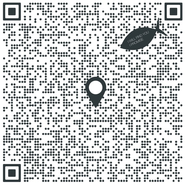
Habasselet wishes you a Merry Christmas and Happy New Year with a special graphic to commemorate the year 2020, titled 'Digital Ocean': Here in Singapore, the QR code became the ubiquitous symbol of 2020 - at every physical location, we had to scan a code to register our presence as part of the country's effort... Continue Reading →

The design of the logo for Habasselet is based on an orthogonal rose. The idea of an "orthogonal rose", which is a rose drawn with straight lines and 90-degree angles, is related to the discipline of architecture and its associated mathematical character. By adjusting the sizes of the resultant squares and rotating the composition, an... Continue Reading →
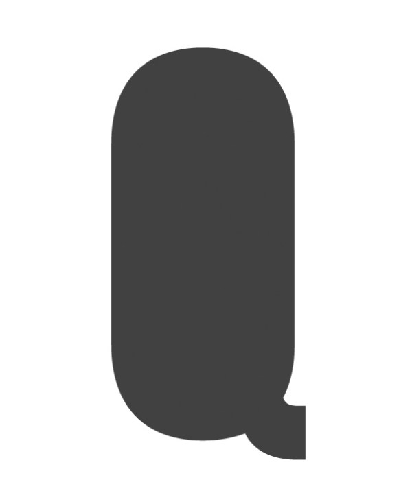
This is a logo designed for Quod Architects X QED Design. Drawn from the common characteristic of both - the starting letter 'Q', we designed a minimalist logo with a certain playful character derived from the particular typography used. An exhaustive investigation of typographical options was done before one was chosen that represents the quirky... Continue Reading →

The dream of the rigid.
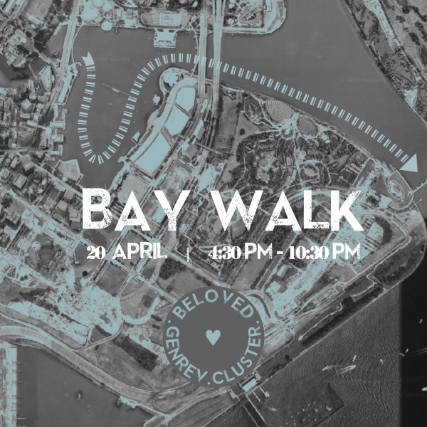
A design of a set of invite graphics and instructions manual for a church event for young adults. The invite graphics encapsulate the character of the event which is a walk along the Marina Bay, designed using an aerial map and attractions along the route: Contemporary block colors are used to achieve a vibe that... Continue Reading →

A work-in-progress to depict the Book of Genesis by graphic design. In divinely inspired texts like in the Book of Genesis, translation is not only from Hebrew to English, but from the mind of God to the mind of man - a profound endeavor that multiplies many times the intricacies of inter-language translation and magnifies... Continue Reading →
Beauty is in proportion - a maxim we know well. This is a theoretical project comprising of a series of rooms in a landscape, each room becoming successively smaller as dictated by the golden ratio found in nature. An investigation of form and beauty, and an exercise in mystery. Which is the final room in... Continue Reading →

We designed the story and graphics for a 2D platformer game called 'Til Death Do Us Part. Story: Old Man and Old Woman encounters a spell.Old Woman starts to become younger and younger.Game ends if Old Woman becomes a Baby. Objective: Old Man holds Old Woman's hand, and they race against Time, to avoid the... Continue Reading →
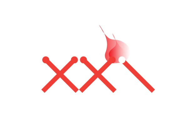
The logo designed for a church, whose founding pastor's vision was for every church member to be like an igniting matchstick, "when each matchstick moves on to light up something else…a logo that encapsulates ongoing movement, a spreading of culture/ change/ influence." The symbolic vision of a burning matchstick being the anchor of the design,... Continue Reading →

A design made for an Easter event in New York City. The logo uses polygonal shapes that are tessellated to form a fresh interpretation of the traditional Easter bunny. It is an exercise in simplicity, using geometrical forms to recreate an image of something as organic as a fluffy rabbit. The final design of the... Continue Reading →

A set of seven hand-bound booklets made for a design portfolio. The traditional technique employed was kettle stitch using awl, needle and thread for a handcrafted and unique feel.

A shirt designed for a church youth cell group, based on the theme of "Latter Rain" (Zechariah 10:1). The design concept is minimalist - drawing the essential link between grand scripture and everyday street youth.