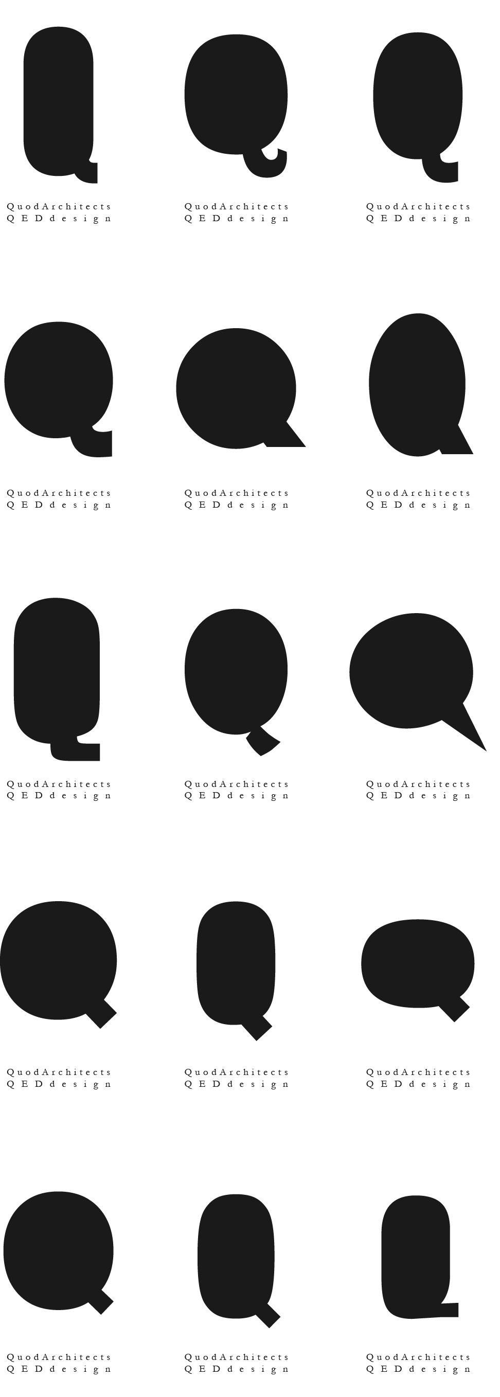
This is a logo designed for Quod Architects X QED Design. Drawn from the common characteristic of both – the starting letter ‘Q’, we designed a minimalist logo with a certain playful character derived from the particular typography used. An exhaustive investigation of typographical options was done before one was chosen that represents the quirky free spirit that the design studio envisions:
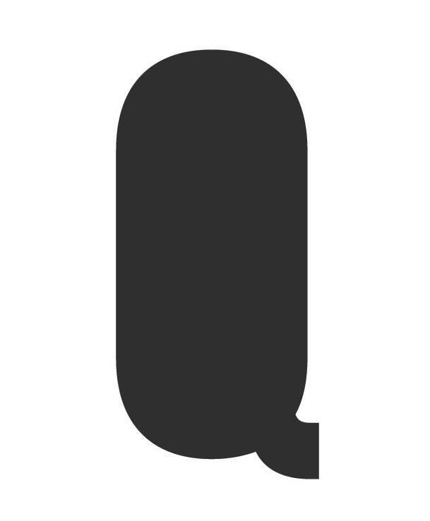
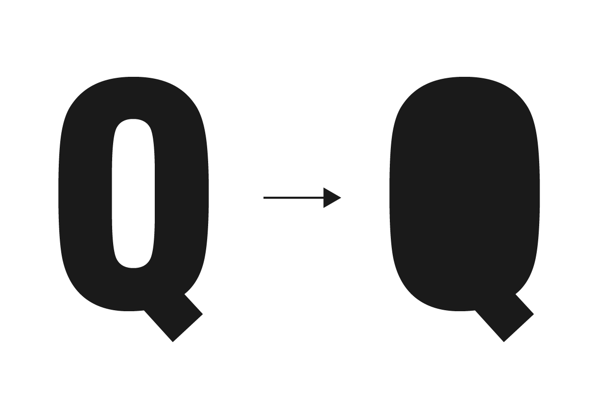
The logo was formed simply by blacking out the donut-hole of the letter ‘Q’:
The rest of the magic of the logo design rested in the proportion, size and color of the ‘Q’ as related to the paper space of the name card and website:

For the namecard, we designed an alternative cover with nine logos arrayed in a 3×3 matrix. The result is reminiscent of the facade of a traditional Singapore shophouse with windows – a wink to the studio’s interest in the local architectural and historical context.
